How this site is made
The design system under this page
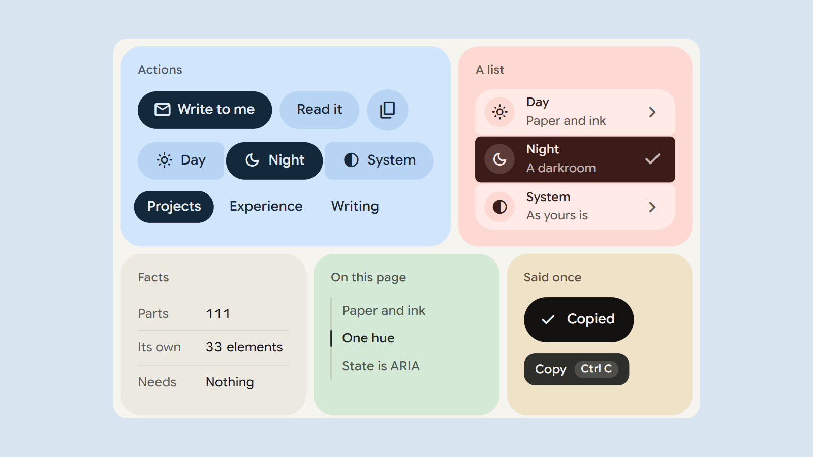
Everything on this site is drawn with Mereframe Components, a design system I wrote for my own products. It is the look of mereframe.com and of Lensfield, and it is 111 components in one stylesheet and one script, with no dependencies. The library is not published, so this is not a tour of all of it. It is an account of how it is put together, shown with the eleven parts this page uses, and every line quoted here is in the two files your browser has already fetched.
Six rules
The stylesheet opens with the rules it keeps everywhere:
- no gradients and no glows, only solid tonal surfaces;
- soft and rounded, never sharp-edged;
- a control never grows, moves or reveals text on hover, and a press answers with shape, never with size;
- hints live in tooltips, never inline;
- nothing is printed on a photograph;
- selection is ink, and a hue appears only where it means something.
A design system is mostly decisions made once, so that they are not made again in a hurry. These six settle more than they seem to. The globe on the first page is drawn by hand because the usual library for one draws a lit sphere with a glow around it, and the first rule forbids both.
Paper, panel, control
The page is paper. On it stand panels, which are rounded surfaces a thin gutter apart, and on a panel stand controls. Each surface tells whatever is inside it two things: the ground it is standing on, and the tone a control should take there.
.panel { background: var(--g); --here: var(--g); --tone: var(--g2); }
.btn   { background: var(--tone); color: var(--ink); }
So a button has no variant for each background. It reads its tone from wherever it has been put.
A ground from one number
A panel’s colours are not chosen one by one. They are worked out from a hue, and from a chroma that says how strong it is, in OKLCH, where a step of lightness looks the same size whatever the hue.
.tone {
  --g:   light-dark(oklch(.915 … var(--h)), oklch(.265 … var(--h)));
  --ink: light-dark(oklch(.27 … var(--h)),  oklch(.96 … var(--h)));
}
The ground, a deeper tone for controls, a lighter one for cards, the ink and a quieter ink all come from that one hue, by day and by night. The lightnesses are fixed and only the hue turns, so the ink keeps its contrast on the ground whichever hue it is given. The side panel of this page is hue 245. Each of the three pictures on the first page stands on a panel whose hue was read off the picture itself.
State is ARIA
The chosen segment of a control is not marked with a class of its own. It carries the attribute a screen reader already reads, and the stylesheet styles that attribute.
.seg > :is([aria-pressed=true], [aria-checked=true], …) {
  background: var(--ink); color: var(--tile);
}
What is said and what is shown cannot drift apart, because they are the same thing. This one works:
A press answers with shape
On a press, a button’s corners tighten and nothing else changes. Nothing grows, no shadow appears, and nothing beside it moves.
.btn        { border-radius: calc(var(--h) / 2); }
.btn:active { border-radius: calc(var(--h) * .29); }
The change overshoots a little and settles, as a spring would. The library’s springs are written as CSS easings, so none of this needs a script, and a reader who has asked for less motion gets the same change at once.
Hints, and one piece of news
A control explains itself in a tooltip, which comes after a beat on hover or on keyboard focus and never on touch. The same words reach a screen reader, as the control’s name if it has none and otherwise as its description. News arrives as a toast, one at a time, in a region that is announced.
That button is one element with two attributes, data-tip and data-copy. The script finds them, on this page and on anything added to it later.
What this page ships
The whole library is about 85 kB of stylesheet and 85 kB of script, gzipped. That is reasonable for a product and wasteful for a page of words that uses a tenth of it.
Both files are built in named parts, so this site’s build keeps the eleven it draws (button, icon button, segmented group, link, navigation, list of contents, list, facts, toast, tooltip and code) and leaves the rest out. The stylesheet goes from 400 kB to 59, and the script from 289 kB to 21, which is 15 kB and 8 kB gzipped. If a page uses a part that was left out, the build stops and names it.
None of the library’s thirty-three custom elements is among the eleven. Everything on this page is a plain element with a class, which is why it reads the same with the script off.
What it costs
Three things, so far.
It needs a browser from 2024 or later. light-dark(), registered colour properties and the spring easings have no fallback here, and an older browser gets the words without the surfaces.
Its neutrals are warm, and this site wanted them cool. There is no single switch for that. A panel’s hue is one number, but turning the neutrals took fourteen lines that state each one again.
And it looks like what it grew from. The shapes and the springs are Material 3 Expressive’s, and the typeface is Google’s. That suits a camera for Android. Here it is an accent I chose, not one I made.